
在上一期实操分析中我们已经使用featureCounts获得了表达矩阵文件gene_counts.txt。- Geneid:基因 ID(例如 ENSG00000141510) Chr:染色体 Start / End:该基因注释区域 Strand:正负链 Length:所有 exon 区域的总长度 后面每一列是每个样本的 reads 计数。
接下来,我们将进行下游分析。这边使用R-Studio进行:
读取数据
#导入所需R包library(DESeq2)library(ggplot2)library(pheatmap)library(org.Hs.eg.db) # 人类基因注释,可根据物种修改library(clusterProfiler)library(enrichplot)# 读取表达矩阵countData <- read.table("/home/rstudio/2_sra/gene_counts.txt", header = TRUE, row.names = 1, comment.char = "#")countData <- countData[, 6:ncol(countData)]# 读取分组信息sample_info <- read.csv("/home/rstudio/2_sra/sample_info.csv", header = TRUE, sep="\t")# 把 sample 列变成行名rownames(sample_info) <- sample_info$samplesample_info <- sample_info[colnames(countData), ]# 检查样本名是否一致all(colnames(countData) == rownames(sample_info))#输出TRUE继续后续分析sample_info.csv根据文献样本信息表分类(124例孕早期(70–100天)和43例孕晚期(254–290天)),group1代表孕晚期,group2代表孕早期。
PCA查看样本情况
#构建 DESeq2 输入对象dds <- DESeqDataSetFromMatrix( countData = countData, colData = sample_info, design = ~ group)# ===== 过滤低表达基因 =====keep <- rowSums(counts(dds) >= 10) >= 5 # 至少在5个样本中表达量 >=10dds <- dds[keep, ]# =====DESeq2 标准化 =====dds <- DESeq(dds)# ===== PCA 可视化 =====vsd <- vst(dds, blind=FALSE)pcaData <- plotPCA(vsd, intgroup="group", returnData=TRUE)percentVar <- round(100 * attr(pcaData, "percentVar"))ggplot(pcaData, aes(PC1, PC2, color=group)) + geom_point(size=4) + xlab(paste0("PC1: ",percentVar[1],"% variance")) + ylab(paste0("PC2: ",percentVar[2],"% variance")) + theme_bw() + ggtitle("PCA of RNA-seq samples") + theme(plot.title = element_text(hjust = 0.5))ggsave(file.path(outdir, "PCA_plot.png"), width=6, height=5) PCA结果显示组间差异明显,group1 与 group2 在 PC1(解释 61% 方差)上几乎完全分开,说明两组之间的整体转录谱差异远大于组内重复间的差异。每组内部的点彼此靠近,说明生物学重复一致性高,数据质量可靠。无批次效应或离群样本。
# ===== 差异分析 =====res <- results(dds, contrast = c("group", "group1", "group2")) #根据自己的分组进行修改,这里我的是group1,group2resultsNames(dds) # 先检查 coef 名称#[1] "Intercept" "group_group2_vs_group1"# ===== log2FC 收缩 =====res_shrink <- lfcShrink(dds, coef = "group_group2_vs_group1", type = "apeglm")# ===== 筛选显著差异基因(使用 res_shrink)=====res_significant <- res_shrink[ !is.na(res_shrink$padj) & res_shrink$padj < 0.05 & abs(res_shrink$log2FoldChange) >= 1, ]#这里阈值可更改# 上下调统计up_genes <- rownames(res_significant[res_significant$log2FoldChange > 0, ])down_genes <- rownames(res_significant[res_significant$log2FoldChange < 0, ])cat("上调基因数:", length(up_genes), "\n")cat("下调基因数:", length(down_genes), "\n")#上调基因数: 2997#下调基因数: 6177绘制火山图
# ===== 火山图数据准备=====res_df <- as.data.frame(res_shrink)res_df$gene <- rownames(res_df)# padj = 0 替换res_df$padj2 <- ifelse(res_df$padj == 0, 1e-300, res_df$padj)res_df$negLog10Padj <- -log10(res_df$padj2)# 显著性标记res_df$sig <- "Not Sig"res_df$sig[res_df$padj < 0.05 & res_df$log2FoldChange >= 1] <- "Up"res_df$sig[res_df$padj < 0.05 & res_df$log2FoldChange <= -1] <- "Down"# 避免极端值ymax <- quantile(res_df$negLog10Padj, 0.99)# ===== 火山图 =====p <- ggplot(res_df, aes(x = log2FoldChange, y = negLog10Padj)) + geom_point(aes(color = sig), size = 1.6, alpha = 0.8) + # 颜色 scale_color_manual(values = c( "Up" = "#BF124D", # 深红 "Down" = "#67B2D8", # 蓝色 "Not Sig" = "grey70" # 中性灰 )) + # 添加阈值线(可选) geom_vline(xintercept = c(-1, 1), linetype = "dashed", color = "grey40") + geom_hline(yintercept = -log10(0.05), linetype = "dashed", color = "grey40") + # 设置坐标范围 scale_y_continuous(limits = c(0, ymax)) + theme_classic(base_size = 14) + theme( axis.line = element_line(size = 0.3), axis.ticks = element_line(size = 0.8), axis.text = element_text(color = "black"), axis.title = element_text(face = "bold"), legend.position = c(0.85,0.85), legend.title = element_blank(), panel.border = element_rect(color = "black", fill = NA, size = 1) ) + labs( x = "log2 Fold Change", y = "-log10(adjusted p-value)" )# 显示print(p)# 保存高分辨率版本ggsave("volcano_cell_style.png", p, width = 6, height = 5, dpi = 300)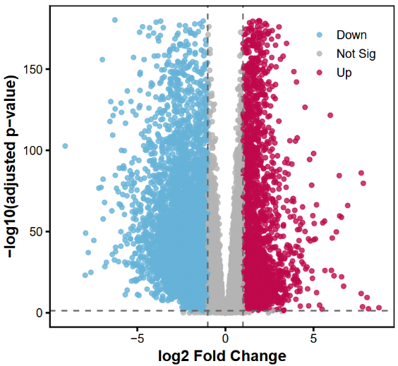
绘制Top200差异表达基因热图
#====热图====sig_genes <- rownames(res_significant)# 提取表达矩阵(原始计数)expr_mat <- counts(dds, normalized = TRUE)[sig_genes, ] # 归一化计数# 对行(基因)做 z-score 标准化expr_mat_z <- t(scale(t(expr_mat)))# 检查矩阵dim(expr_mat_z)annotation_col <- data.frame(Group = sample_info$group)rownames(annotation_col) <- rownames(sample_info)# 按 log2FoldChange 排序(绝对值)res_significant_sorted <- res_significant[order(-abs(res_significant$log2FoldChange)), ]# 选择前 200 个基因top_genes <- rownames(res_significant_sorted)[1:200]expr_top <- counts(dds, normalized=TRUE)[top_genes, ]expr_top_z <- t(scale(t(expr_top)))library(ComplexHeatmap)library(circlize)# 注释列ha <- HeatmapAnnotation(df = annotation_col, col = list(Group = c("group1" = "#357ABD", "group2" = "#D43F3A")))png(filename = "Heatmap.png", width = 6*300, height = 5*300, res = 300) # 绘制Heatmap(expr_top_z, name = "z-score", top_annotation = ha, show_row_names = FALSE, show_column_names = FALSE, cluster_rows = TRUE, cluster_columns = TRUE, col = colorRamp2(c(-2, 0, 2), c("#4575B4", "white", "#D73027")), heatmap_legend_param = list(title = "Z-score"))dev.off()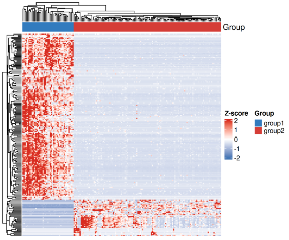
GO/KEGG富集分析
#=====富集分析======# 使用 lfcShrink 的结果res_shrink_sig <- res_shrink[ !is.na(res_shrink$padj) & res_shrink$padj < 0.05 & abs(res_shrink$log2FoldChange) >= 1, ]# 上调、下调分别做富集up_genes <- rownames(res_shrink_sig[res_shrink_sig$log2FoldChange > 0, ])down_genes <- rownames(res_shrink_sig[res_shrink_sig$log2FoldChange < 0, ])# 转换为 ENTREZIDup_entrez <- bitr(up_genes, fromType = "ENSEMBL", toType = "ENTREZID", OrgDb = org.Hs.eg.db)$ENTREZIDdown_entrez <- bitr(down_genes, fromType = "ENSEMBL", toType = "ENTREZID", OrgDb = org.Hs.eg.db)$ENTREZID# 上调基因 GO 富集ego_up <- enrichGO(gene = up_entrez, OrgDb = org.Hs.eg.db, keyType = "ENTREZID", ont = "BP", # 可选 BP/MF/CC pAdjustMethod= "BH", pvalueCutoff = 0.05, qvalueCutoff = 0.05)# 下调基因 GO 富集ego_down <- enrichGO(gene = down_entrez, OrgDb = org.Hs.eg.db, keyType = "ENTREZID", ont = "BP", pAdjustMethod= "BH", pvalueCutoff = 0.05, qvalueCutoff = 0.05)# 上调基因 KEGG 富集kegg_up <- enrichKEGG(gene = up_entrez, organism = "hsa", pvalueCutoff = 0.05)# 下调基因 KEGG 富集kegg_down <- enrichKEGG(gene = down_entrez, organism = "hsa", pvalueCutoff = 0.05)# GO 富集柱状图barplot(ego_up, showCategory=10, title="GO BP Enrichment - Up")barplot(ego_down, showCategory=10, title="GO BP Enrichment - Down")# KEGG 富集气泡图dotplot(kegg_up, showCategory=10, title="KEGG Enrichment - Up")dotplot(kegg_down, showCategory=10, title="KEGG Enrichment - Down")# 写表格write.csv(as.data.frame(ego_up), file="/home/rstudio/2_sra/GO_up.csv")write.csv(as.data.frame(ego_down), file="/home/rstudio/2_sra/GO_down.csv")write.csv(as.data.frame(kegg_up), file="/home/rstudio/2_sra/KEGG_up.csv")write.csv(as.data.frame(kegg_down), file="/home/rstudio/2_sra/KEGG_down.csv")
至此,我们完成了从下机数据到常规数据分析的全流程。